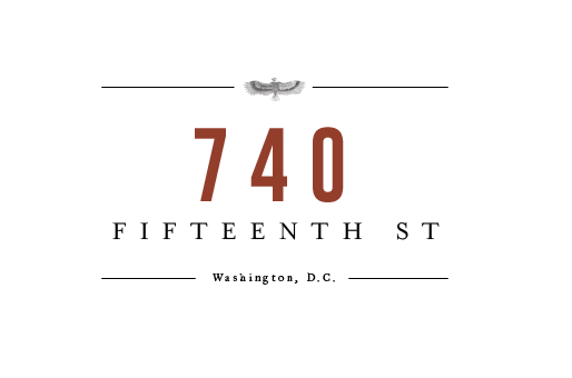
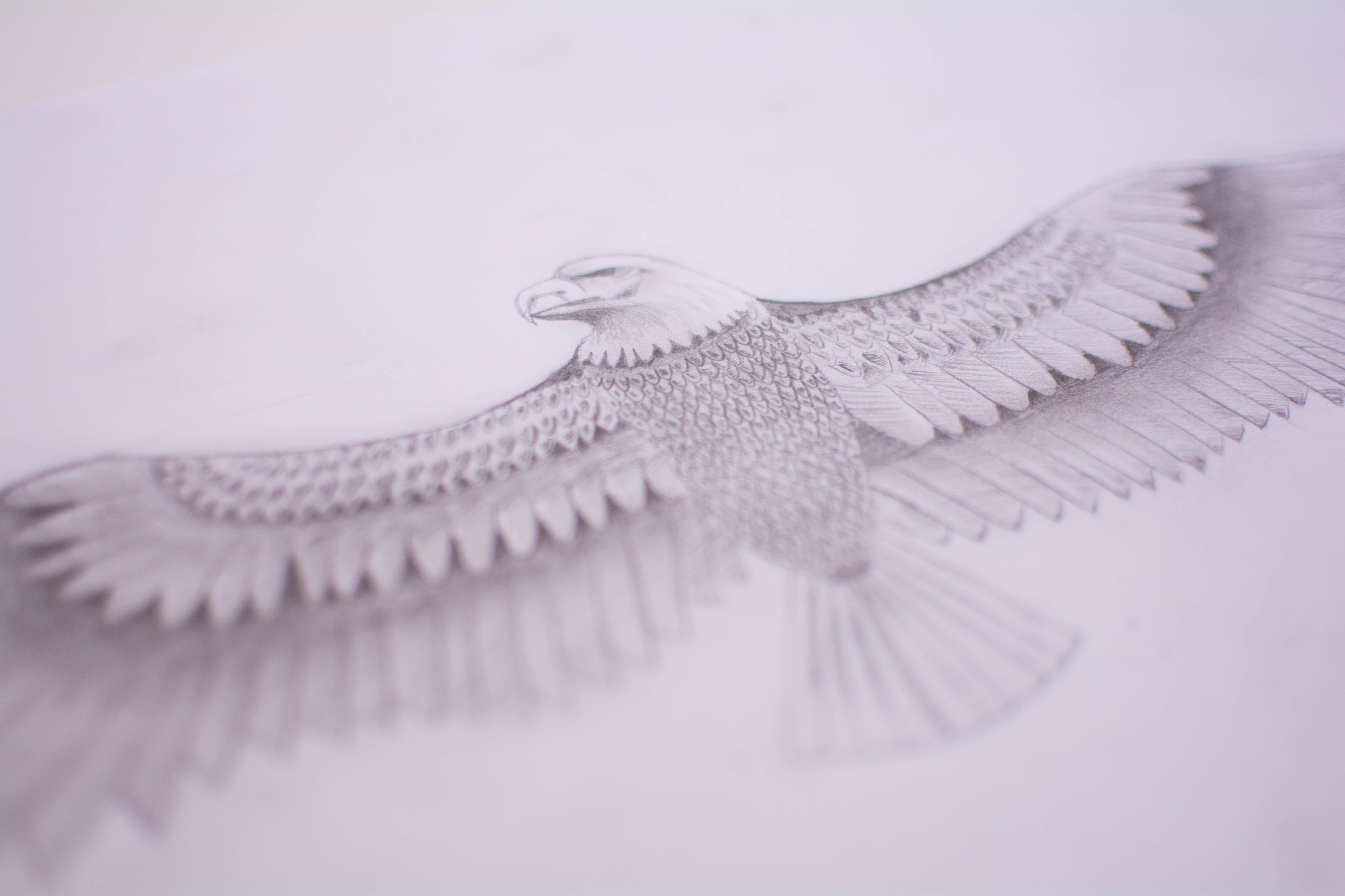
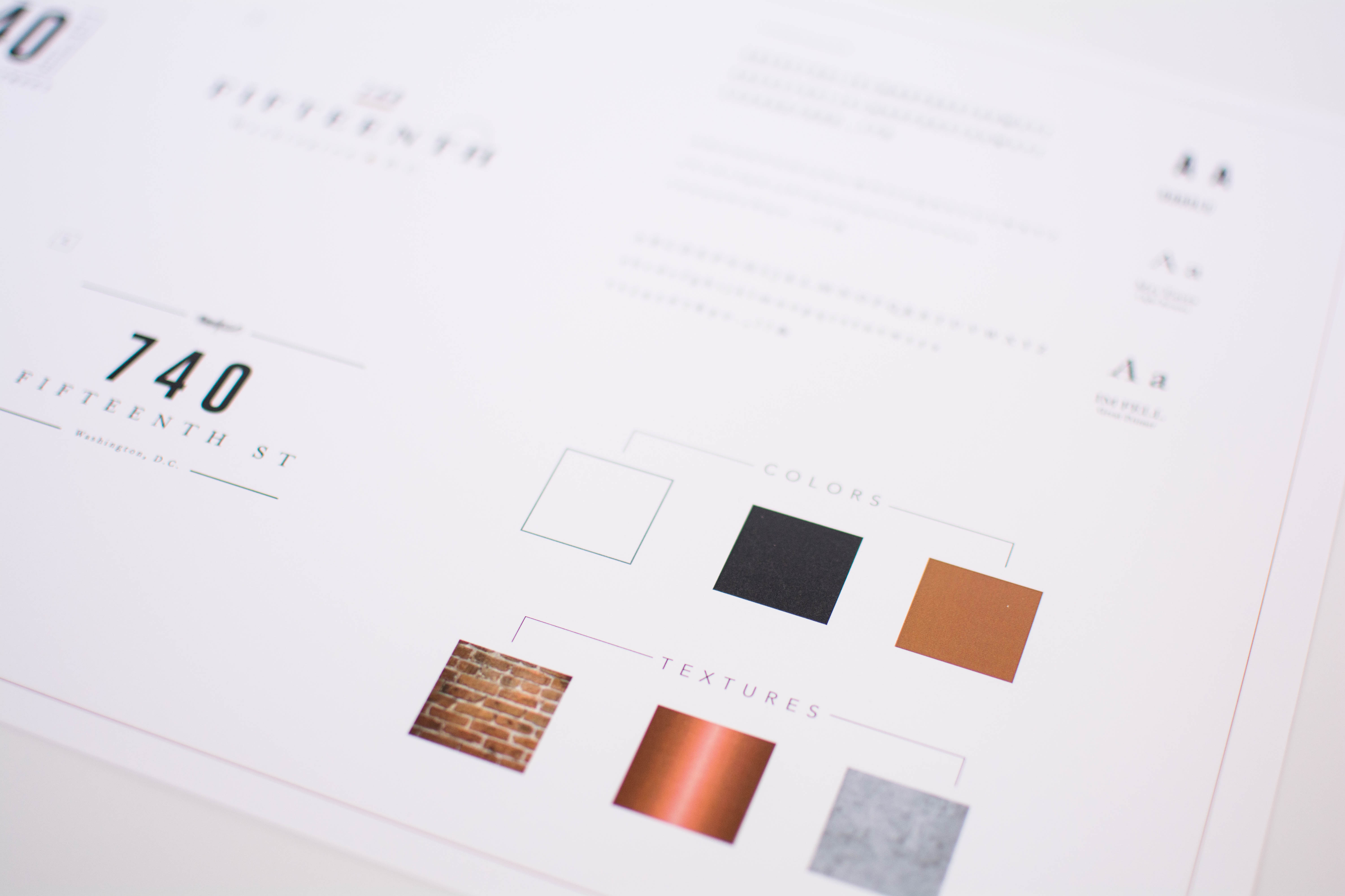
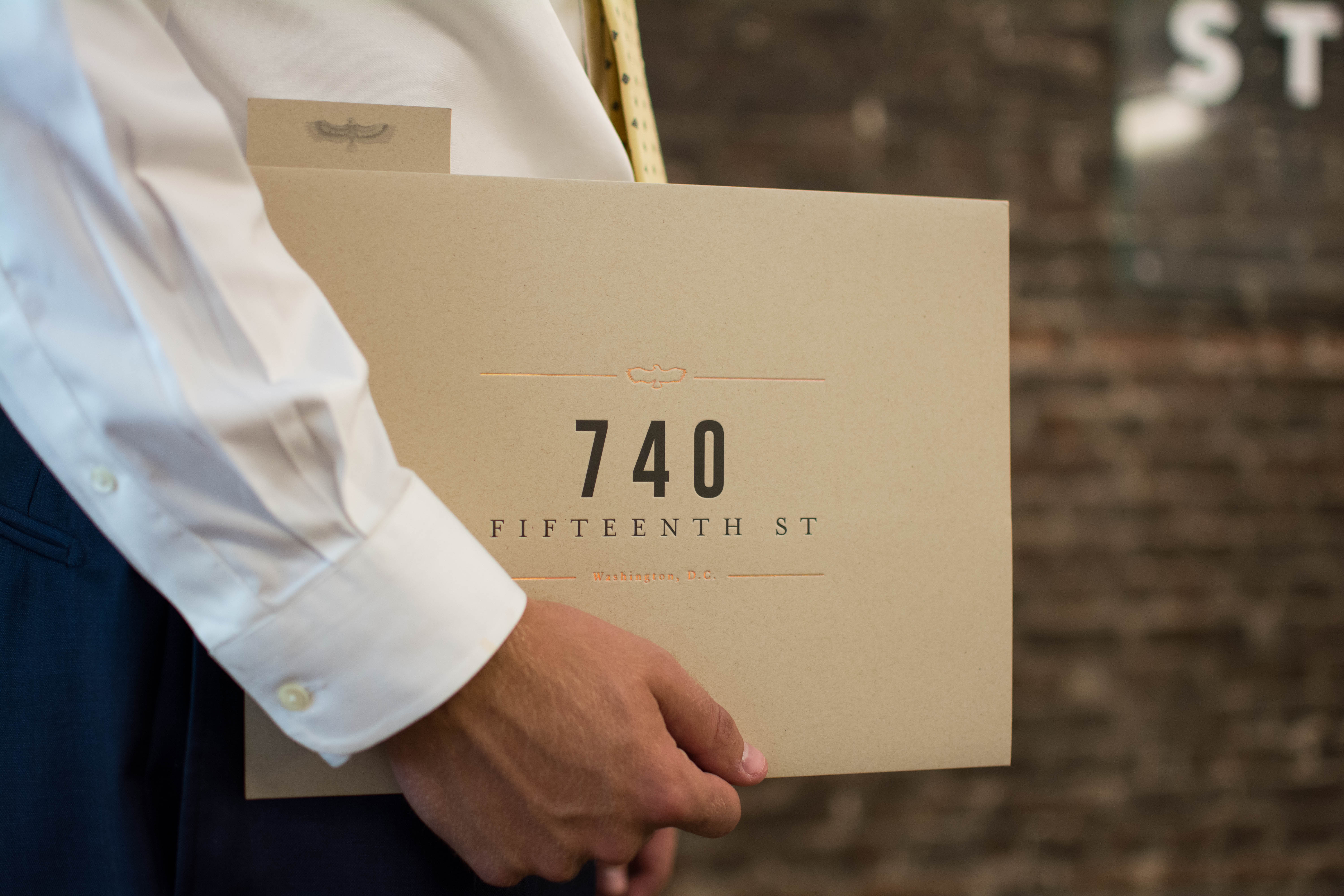
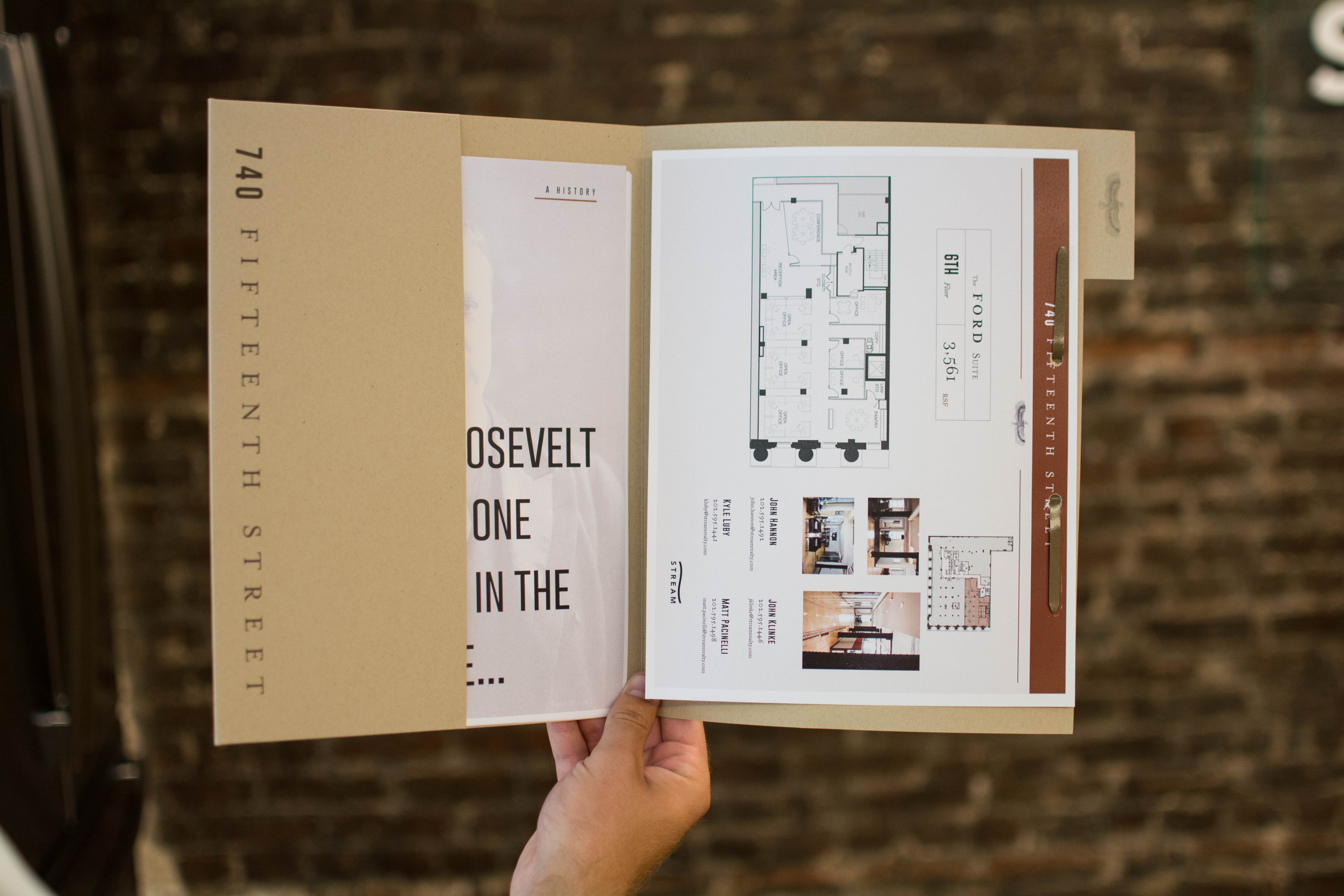
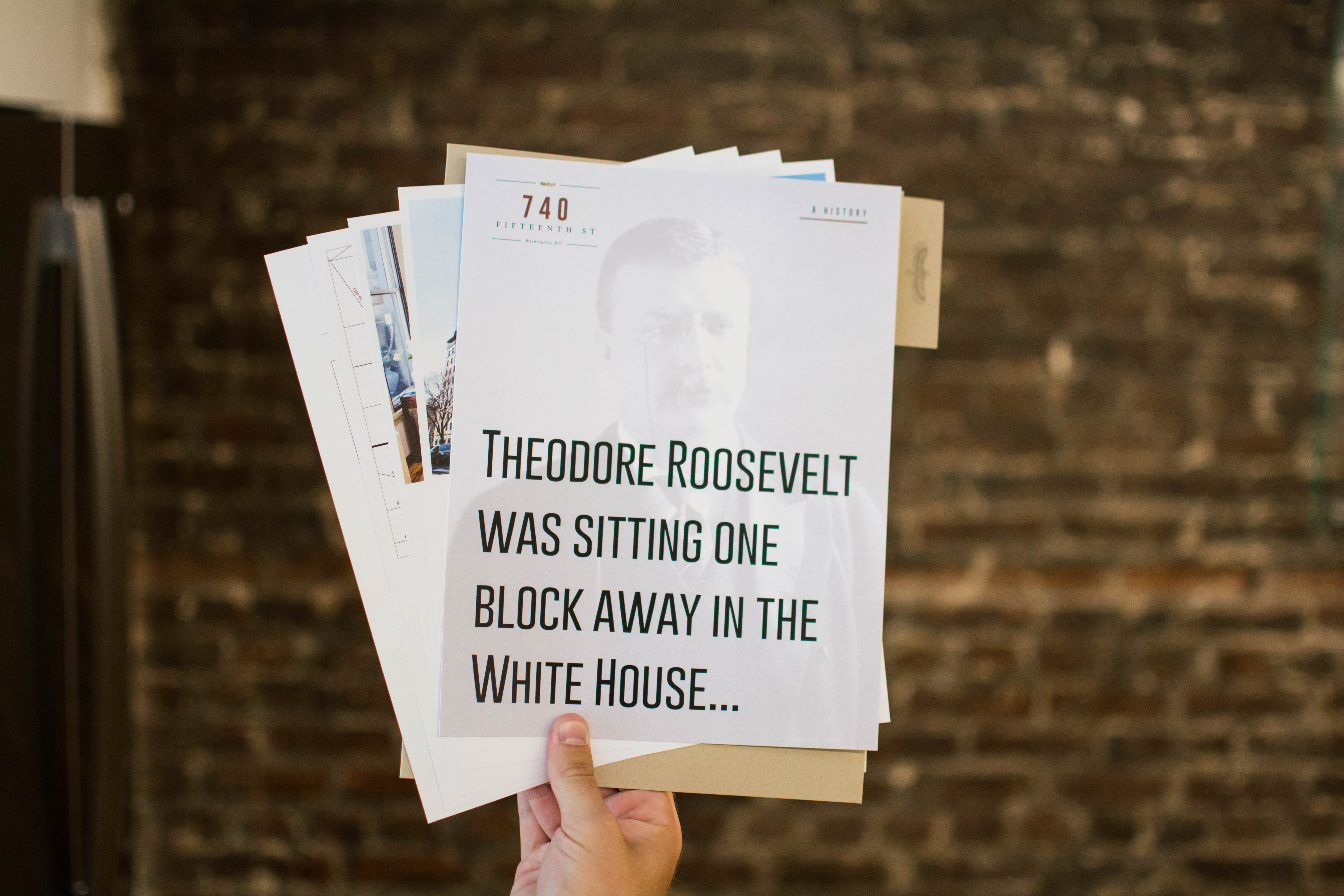
740 FIFTEENTH STREET
www.740fifteenth.comDescribed as historical, industrial & masculine, this brand this brand takes its inspiration from the film Gangs of New York. The building, located at 740 15th Street NW in Washington, D.C., is 1 block from the White House and boasts original brick walls and Carnegie steel beams. The branding combines the historical elements with modern design to bring the brand into the 21st century. The typefaces used are both modern and classic, combined with the shape of an eagle to again emphasize the location near the president's residence in the capital city of America.
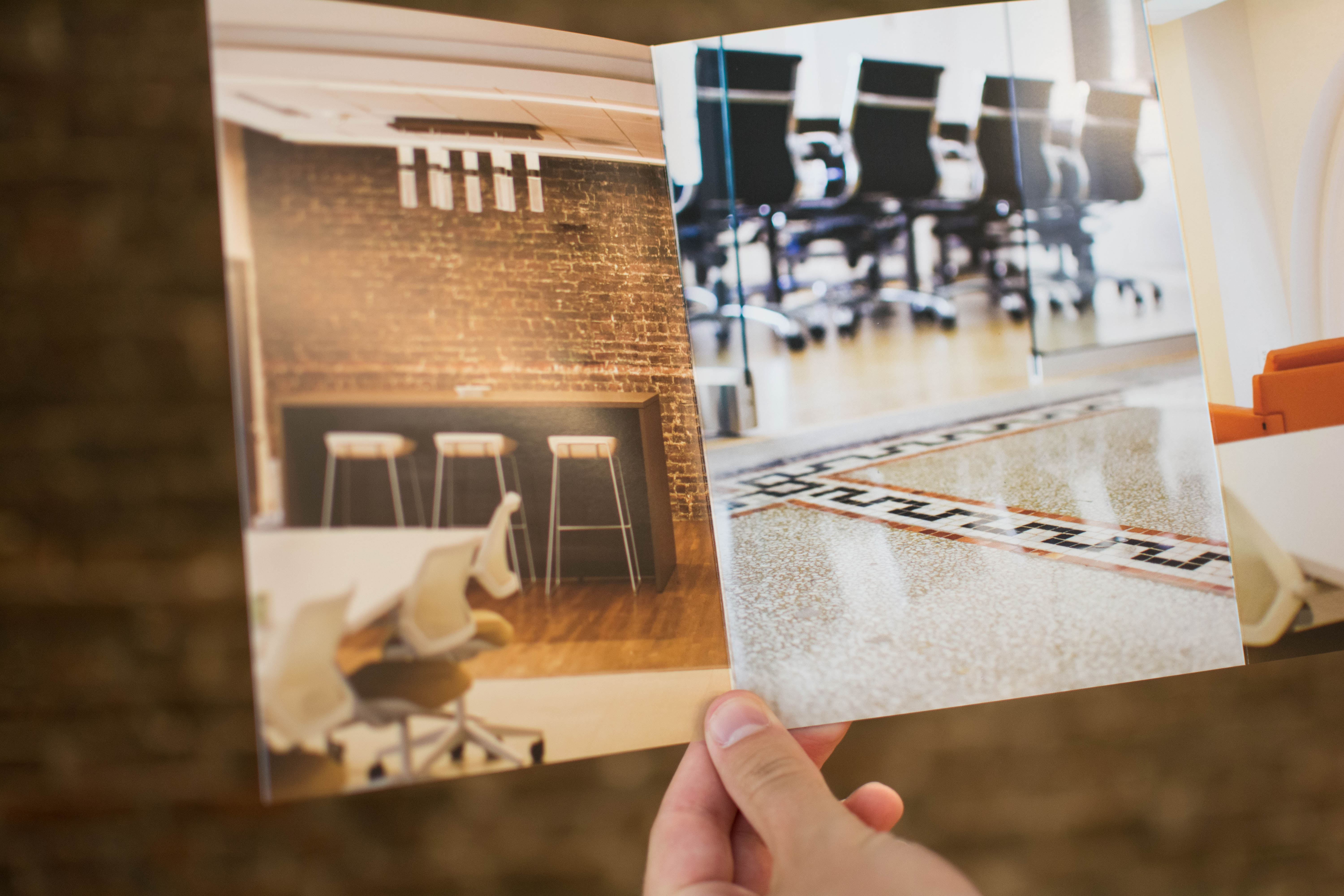
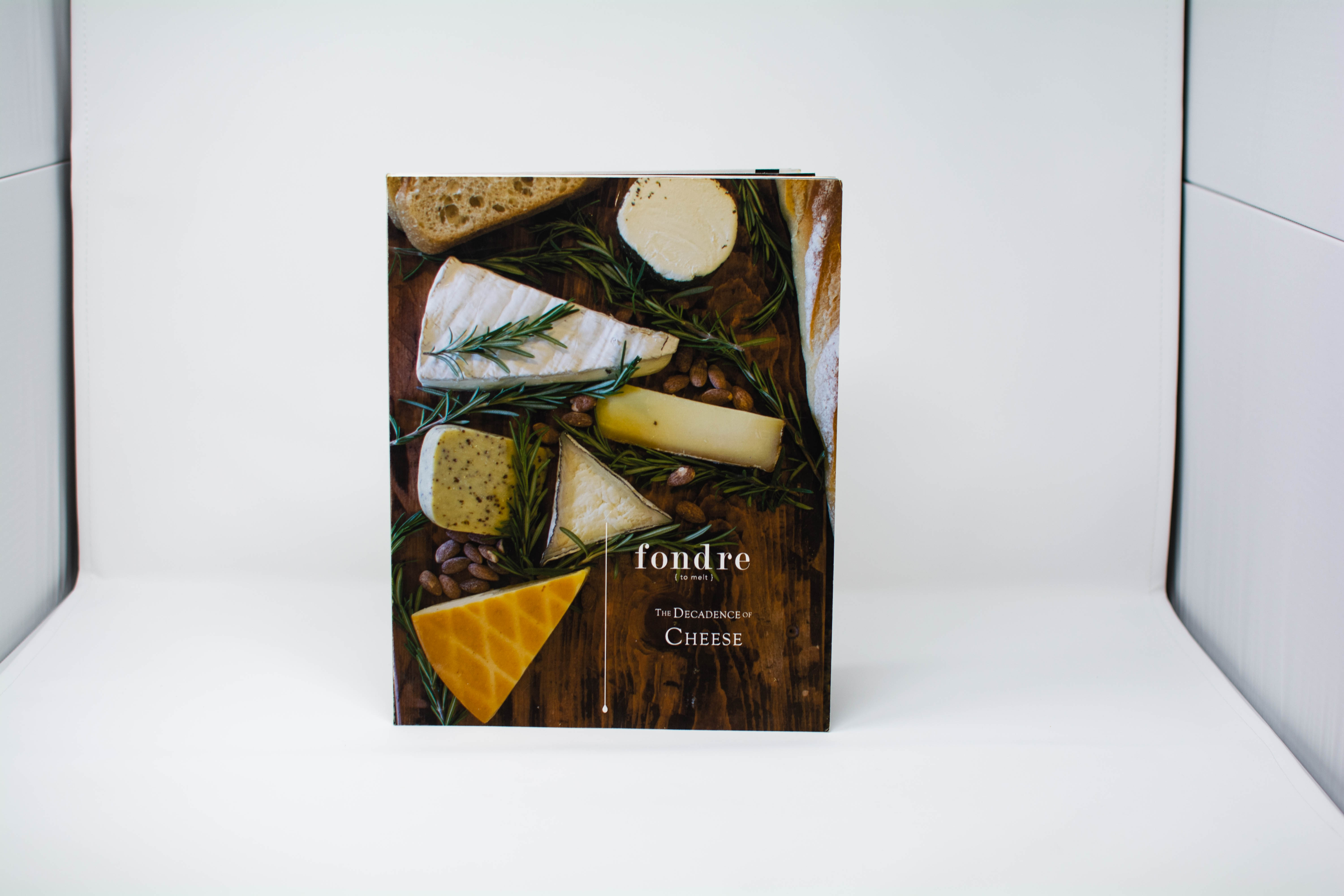
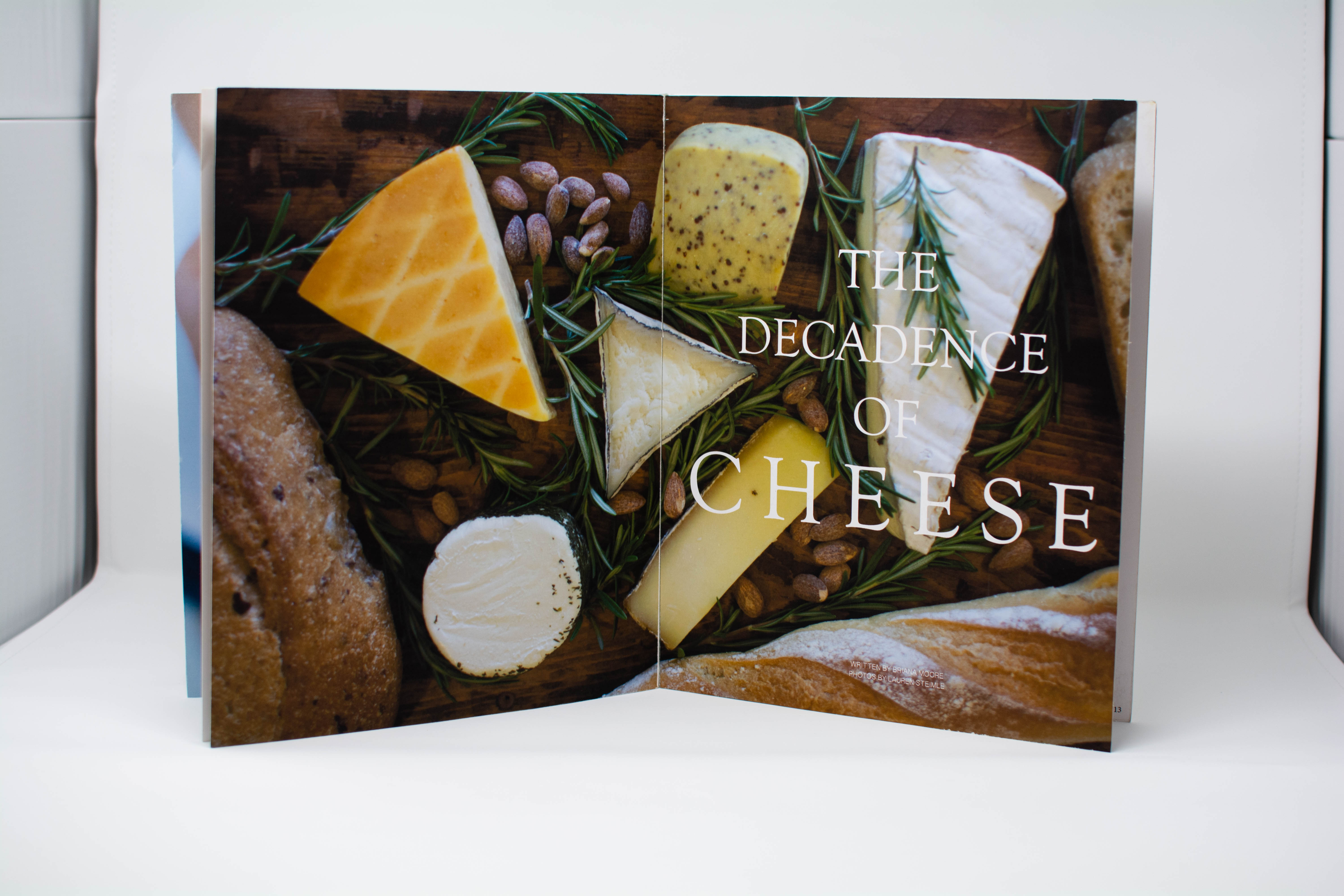
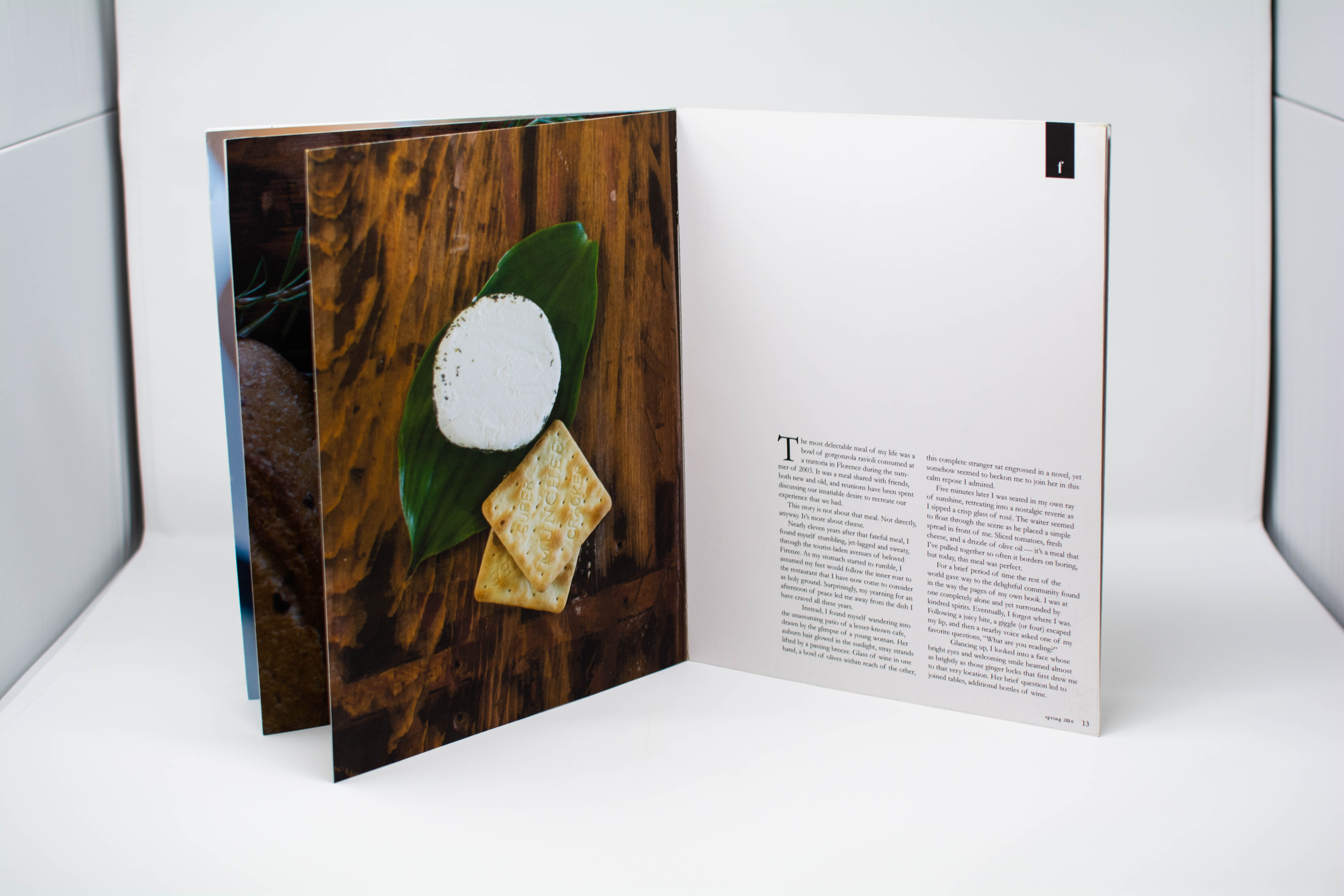
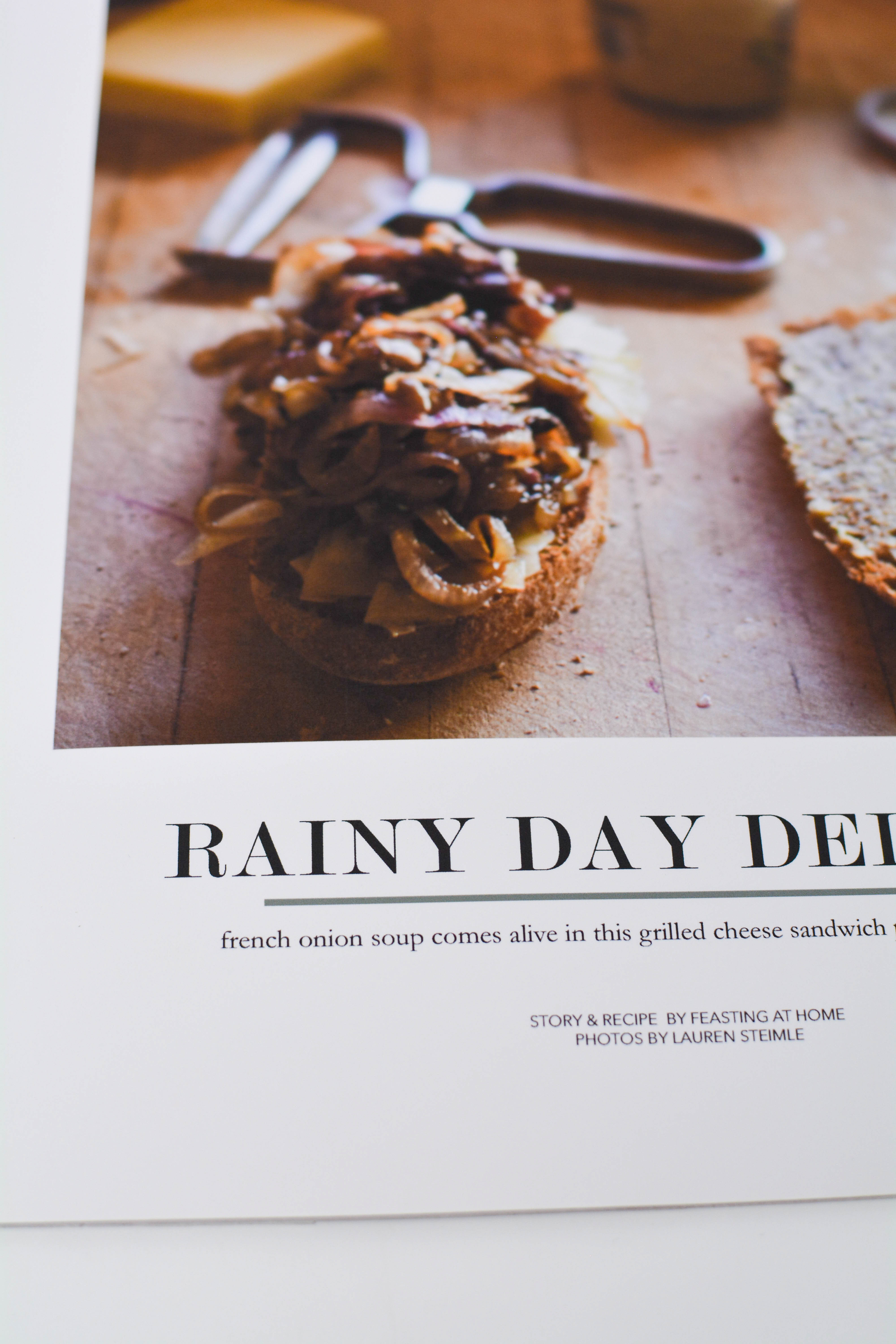
FONDRE
Inspired by culinary love, fondre is a magazine dedicated to grilled cheese. By elevating a simple comfort food to a sophisticated lifestyle, fondre dives deeper into exploring creativity in an unconventional, melty way. The large size of the magazine, matte double thick paper, and full bleed photography makes it stand out of the crowd, while the simple design has you effortlessly flipping pages by page.
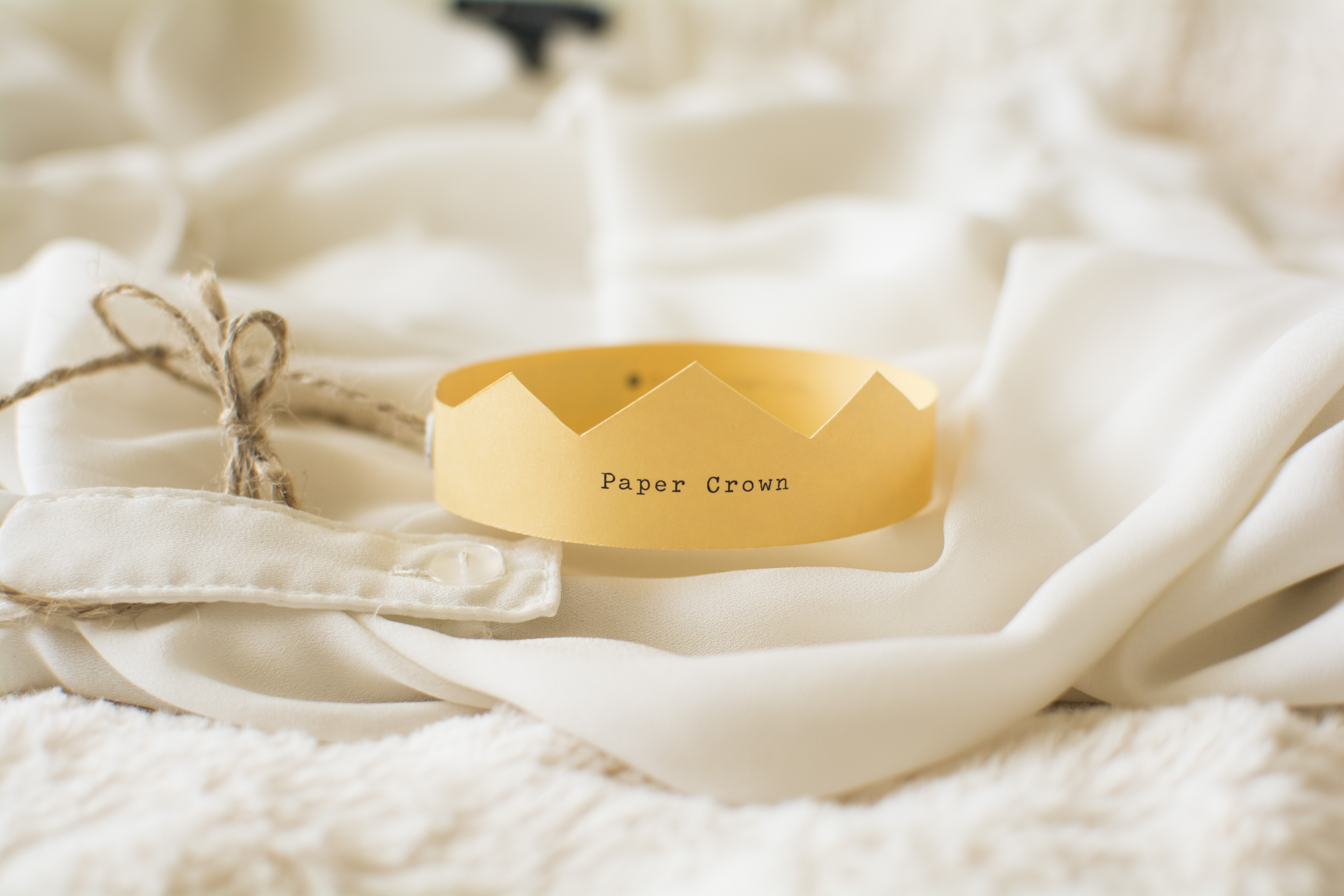
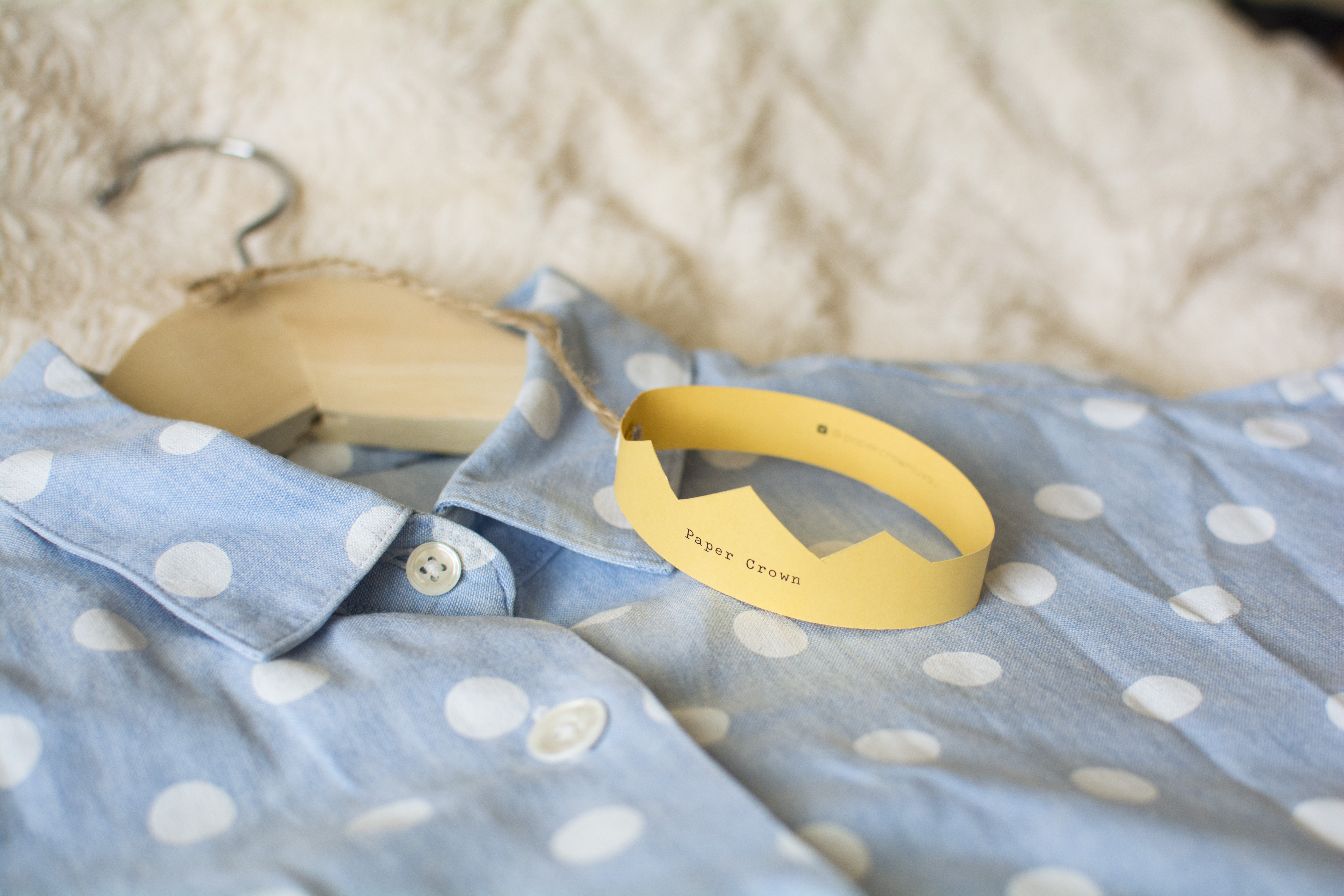
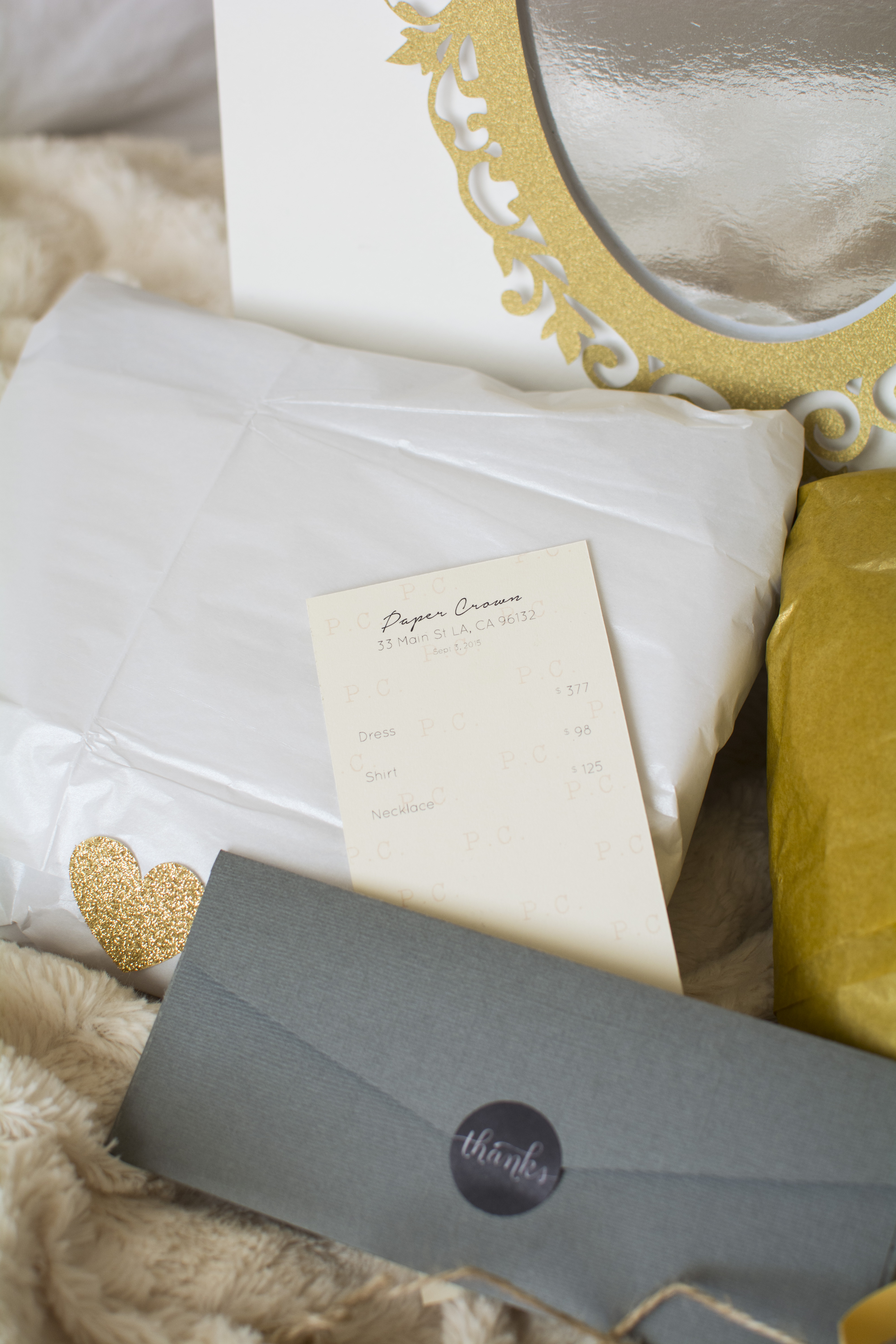
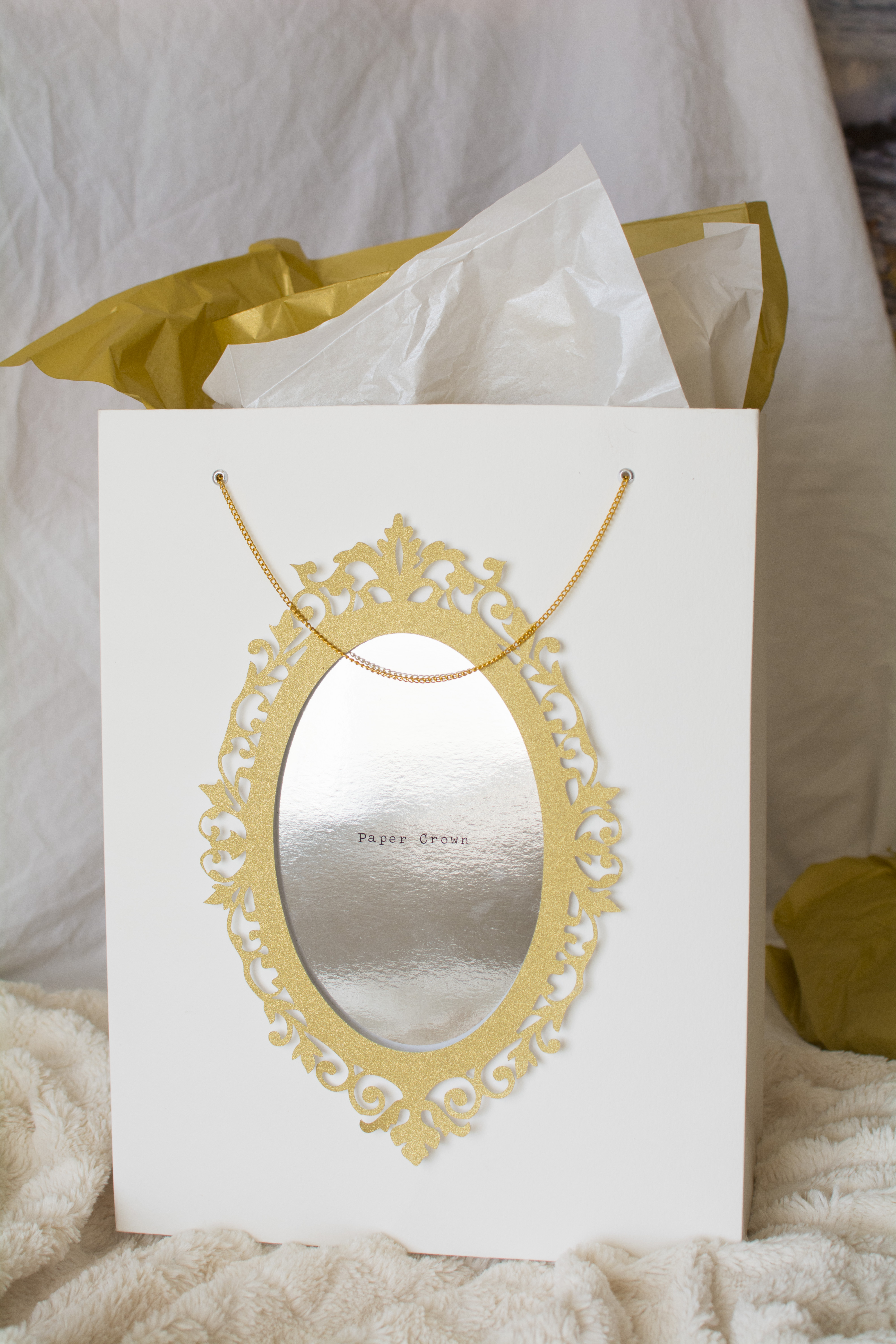
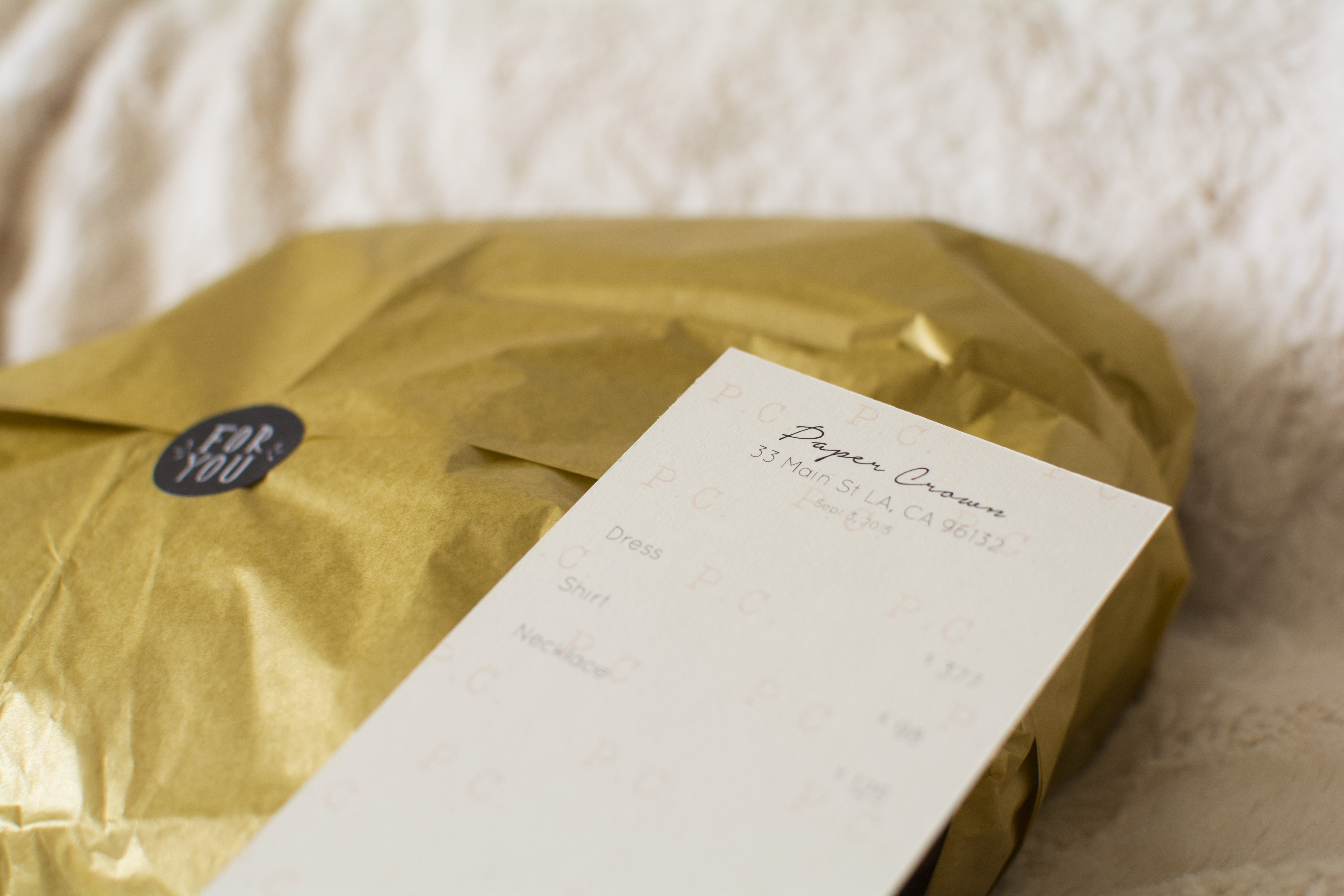
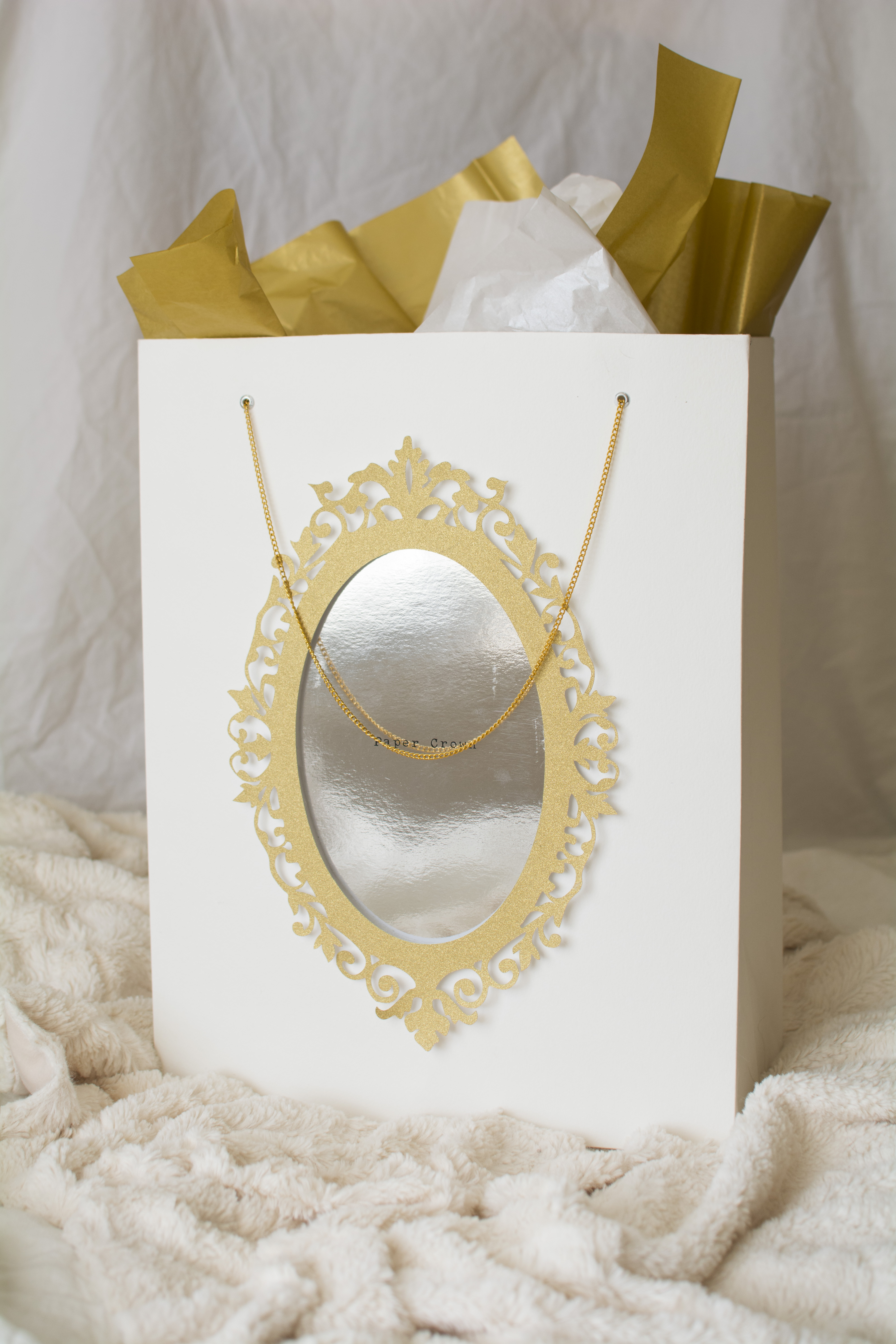
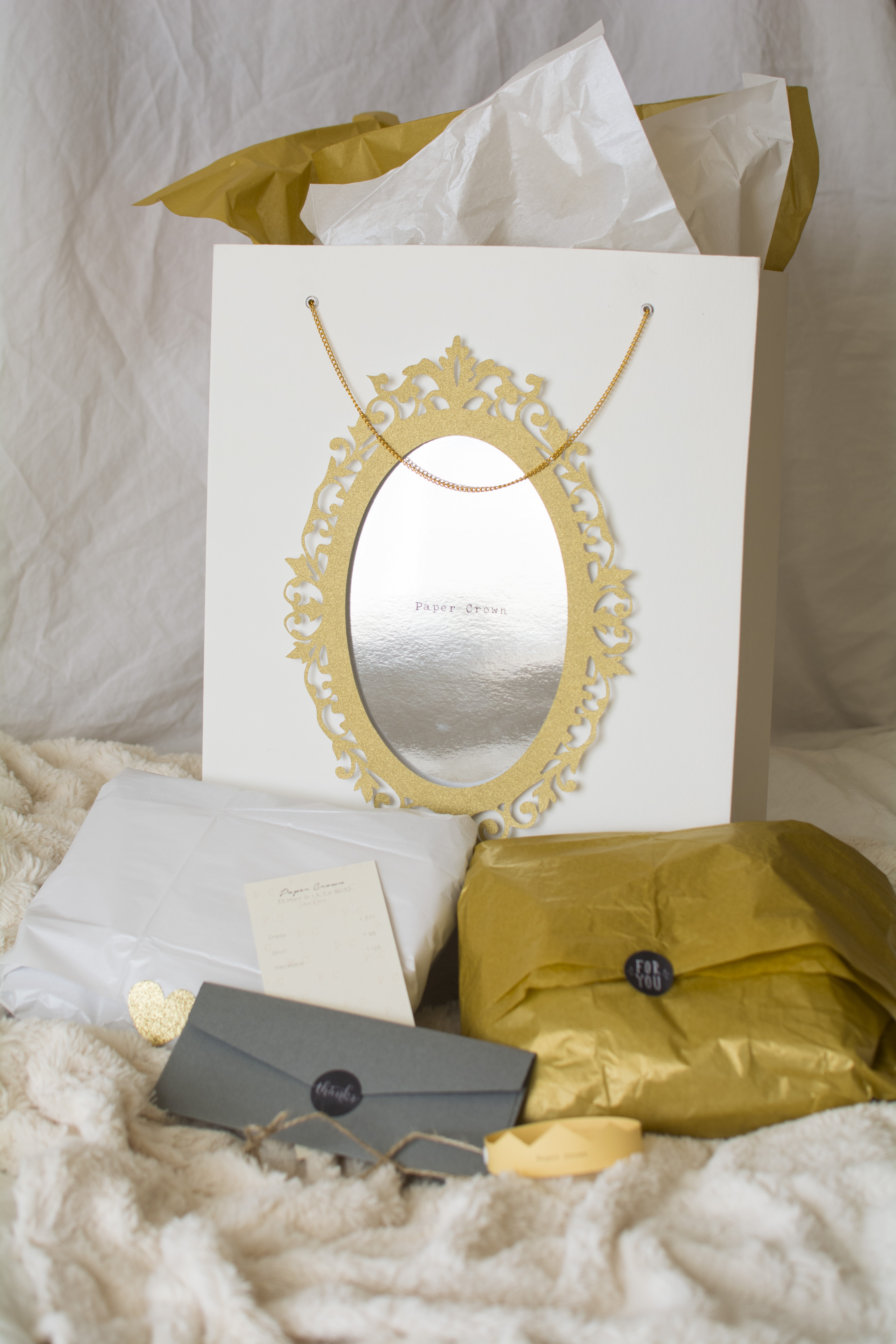
PAPER CROWN
A brand idea for paper crown, a boutique clothing brand designed by Lauren Conrad. Inspired by the hall of mirrors at the Palace of Versailles[MS1] , the shopping bag design is decorated with an intricate gold frame and brand name printed on the reflective "mirror" paper. Thoughtful attention has been paid to the design details such as the watercolor paper from which the bag is made and the gold chain handles attached through white metal eyelets. All elements are delicate and simple with bold silhouettes to make them stand out against the crowd.
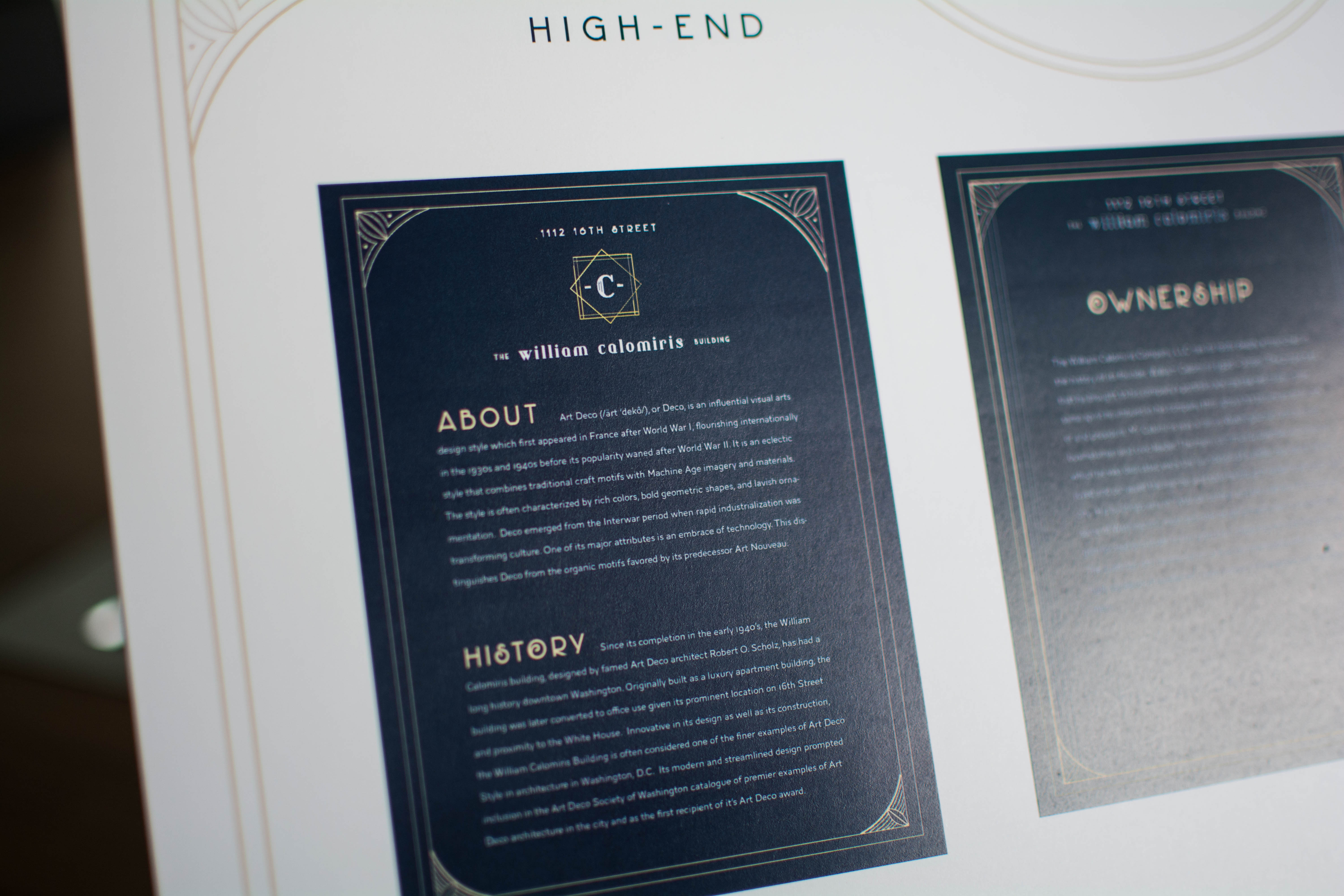
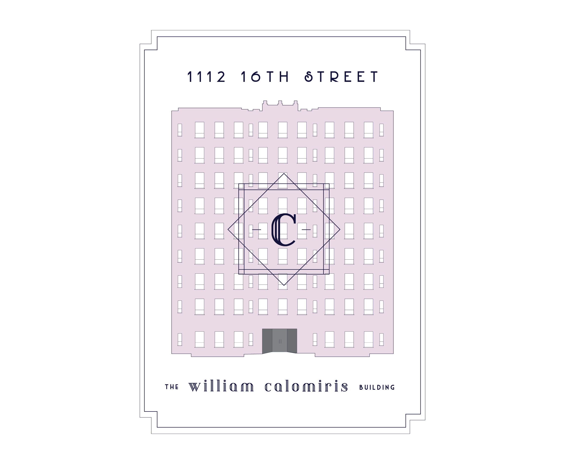
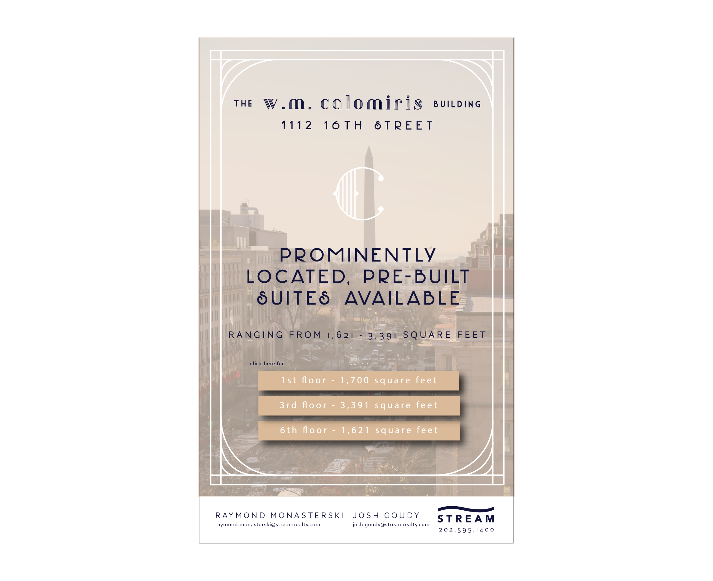
THE CALOMIRIS BUILDING
Few art movements are as fun as the 1920's and Art Deco. A building built in the height of the era with architecture to match, The William Calomiris Building's brand is fun & exciting. The geometric lines & ornate detail invite you to the party! Gold highlights enhanced by navy backgrounds help the booklet stand out while the pale pink taken from the color of the building is included in an eye-catching illustration postcard. This brand would definitely be Gatsby approved.
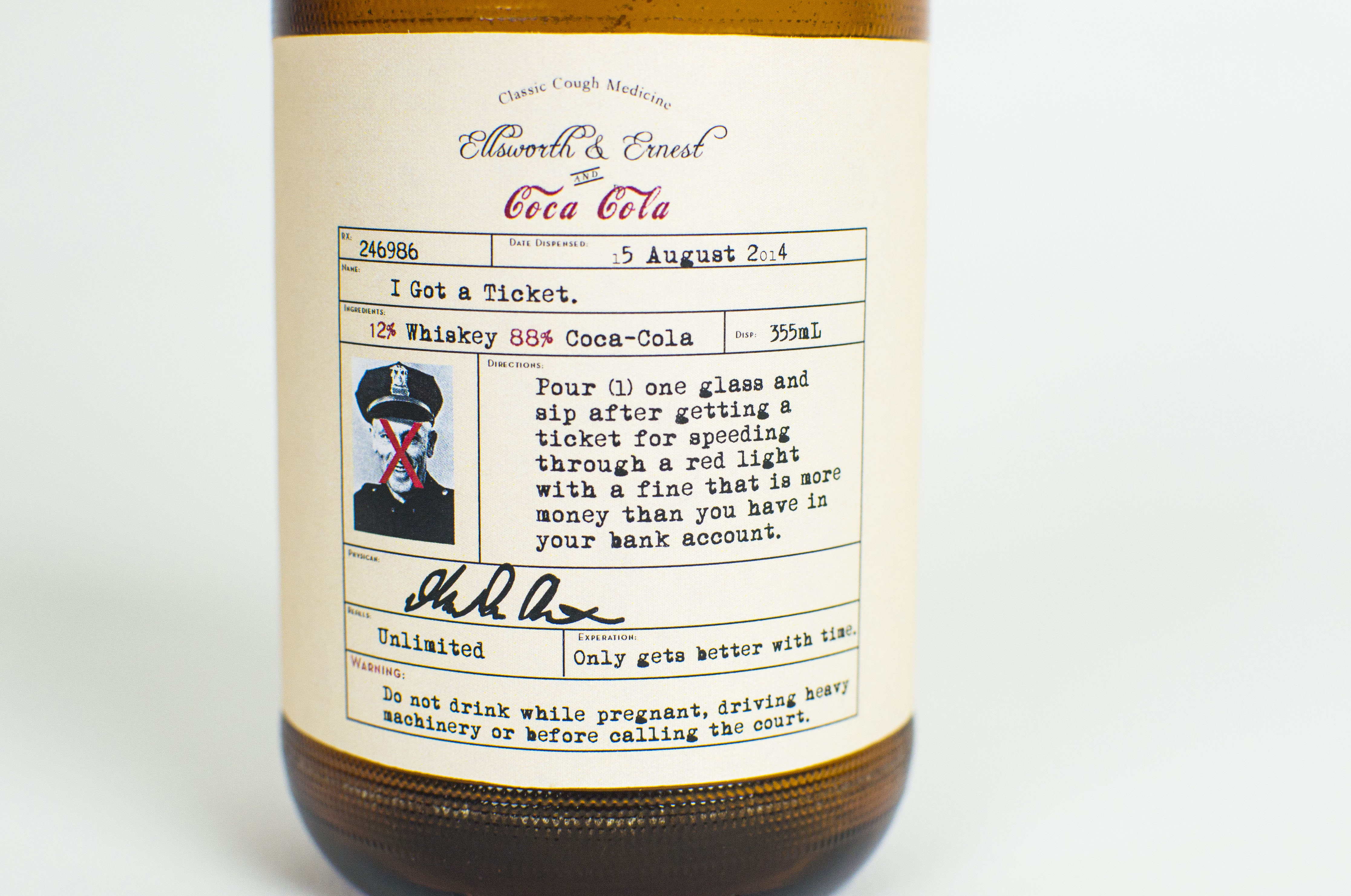
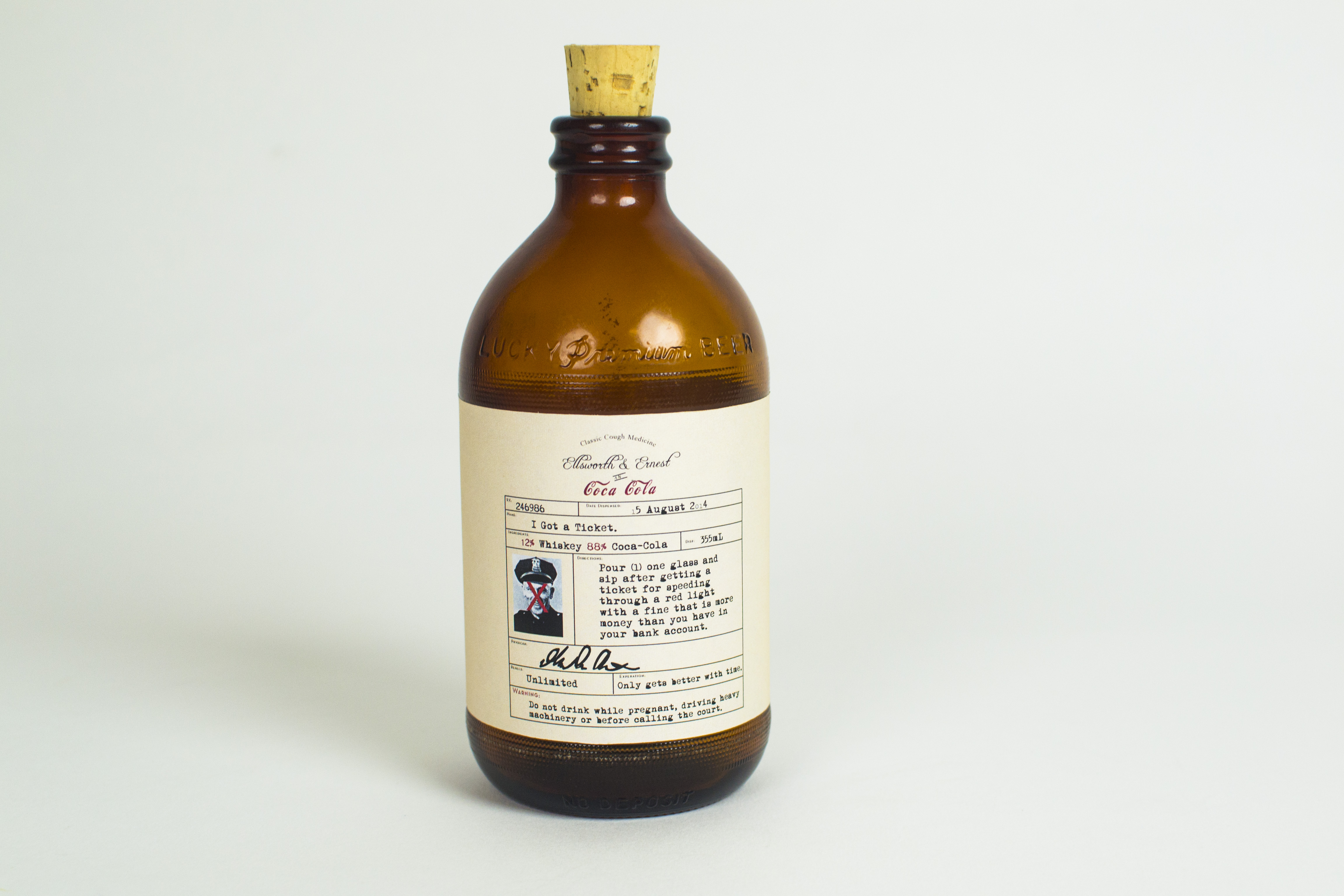
Ellsworth and Ernest
Had a bad day? how bad? Got a ticket bad or got dumped bad? Ellsworth & Ernest is a whiskey/root beer cocktail that will soothe a soul troubled by parking violations, breakups, and everything in between. Pulling from grandfathers Ernest Steimle and Ellsworth Manatt, this whiskey is the perfect concoction of old school charm and a chuckle. The label design is inspired from 19th century amber apothecary bottles; fun old timey photos are paired with strong red x’s to emphasize the drink name.
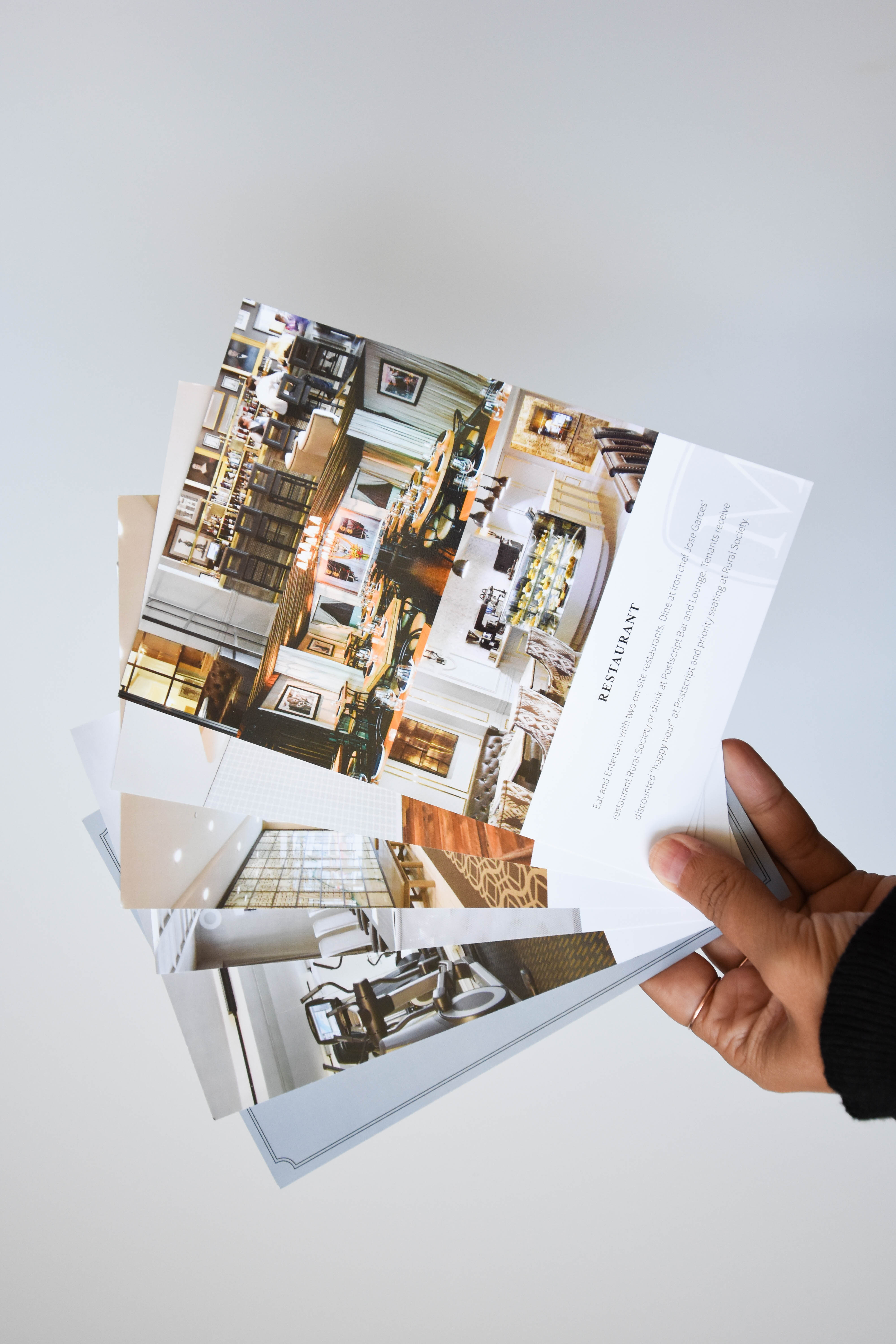
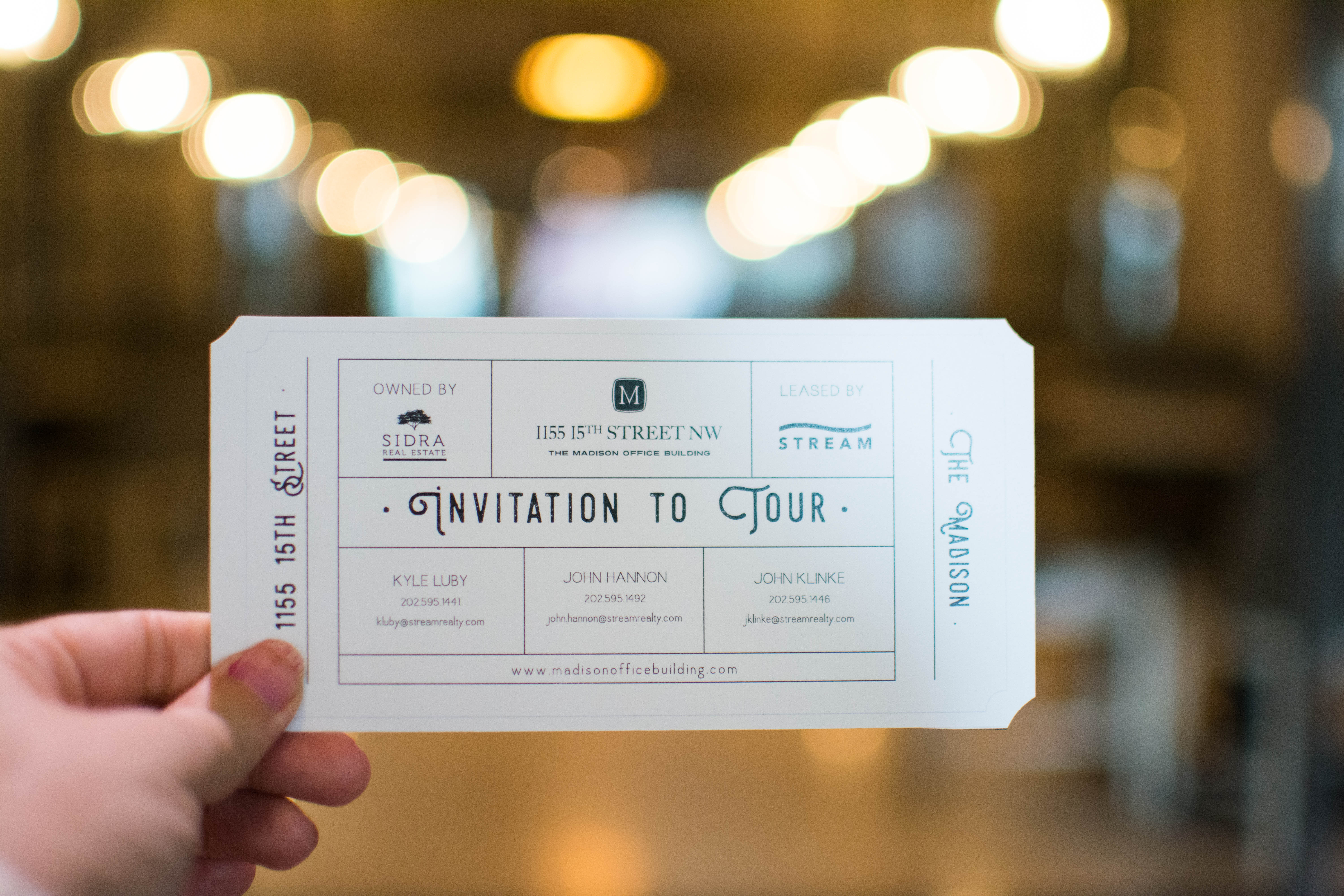
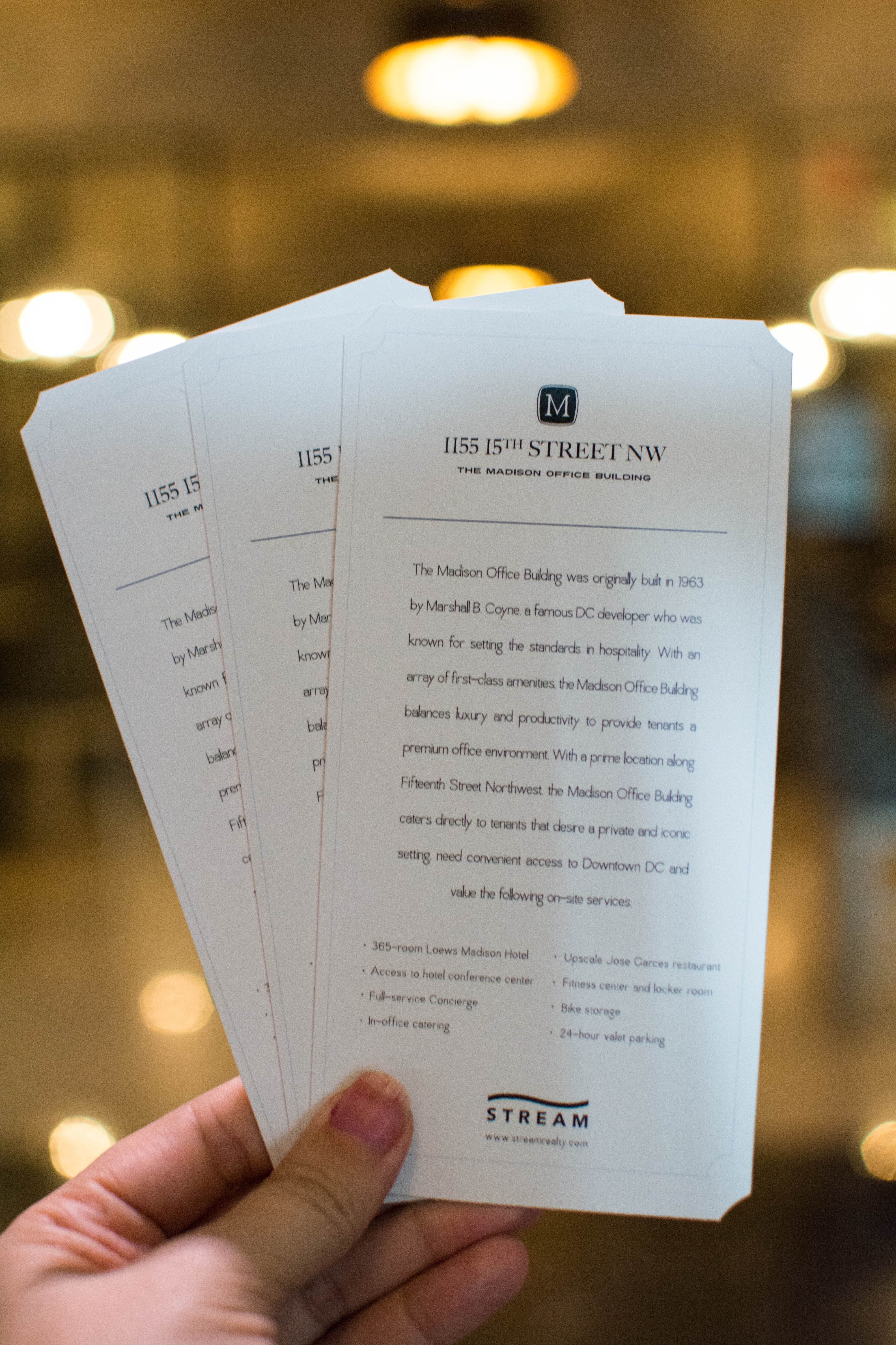
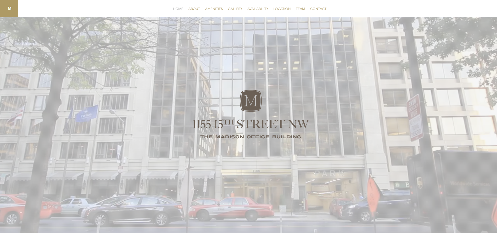
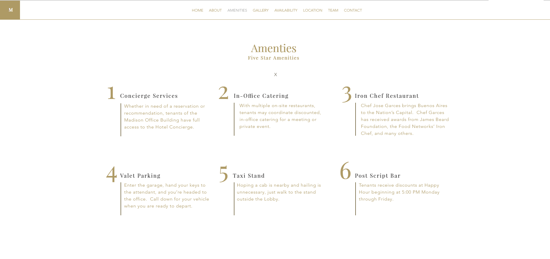
The Madison Office Building
www.madisonofficebuilding.comClick the link to above to see the website for yourself. This beautiful office building attached to the Madison hotel shares beautiful amenities - from the restaurants to the fitness center. A timelapse video placed on the home page advertises its active location. Short, simple and sweet, the information about the building is broken up into digestible pieces and paired with beautiful photos and design elements, making it easy to scroll through.
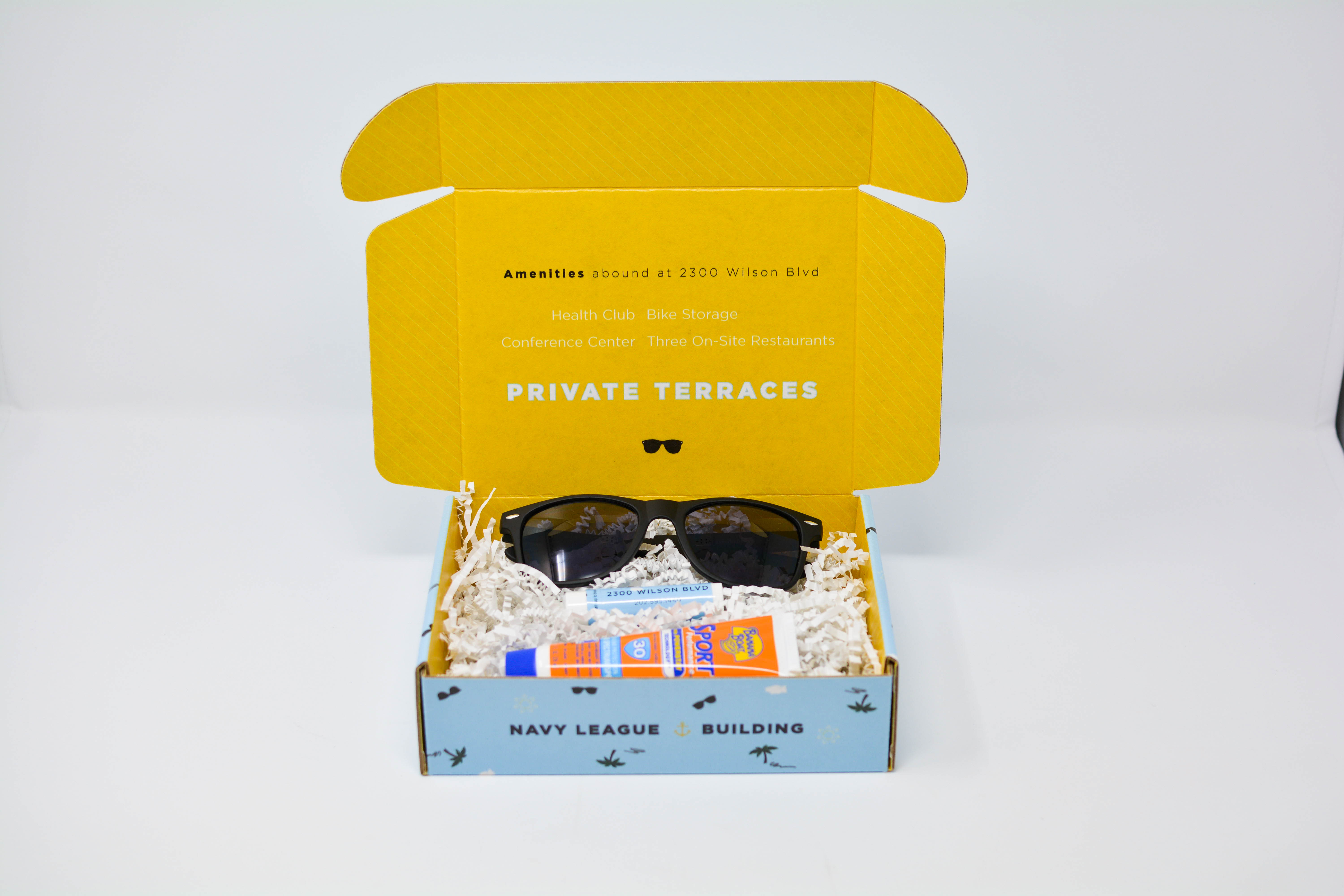
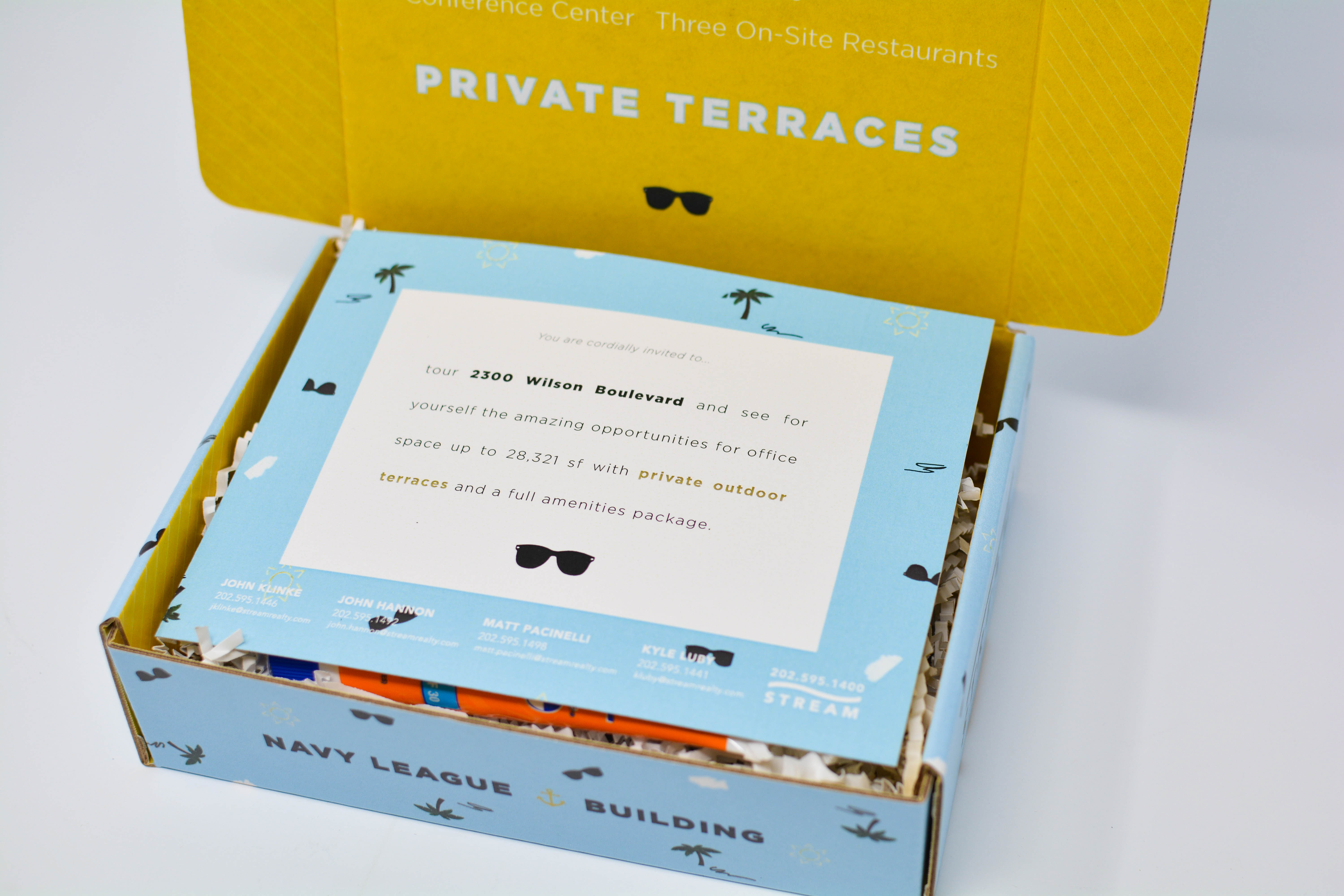
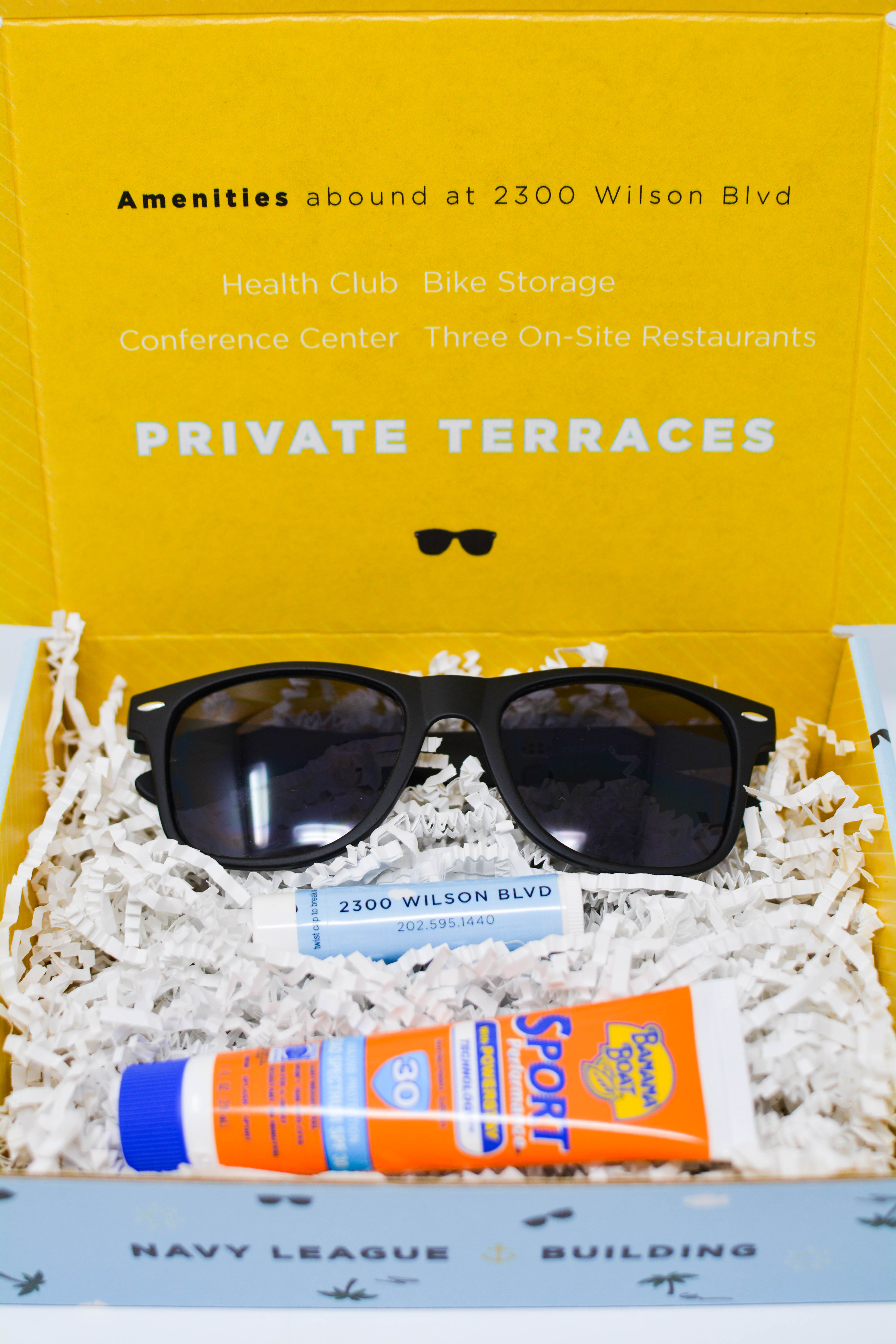
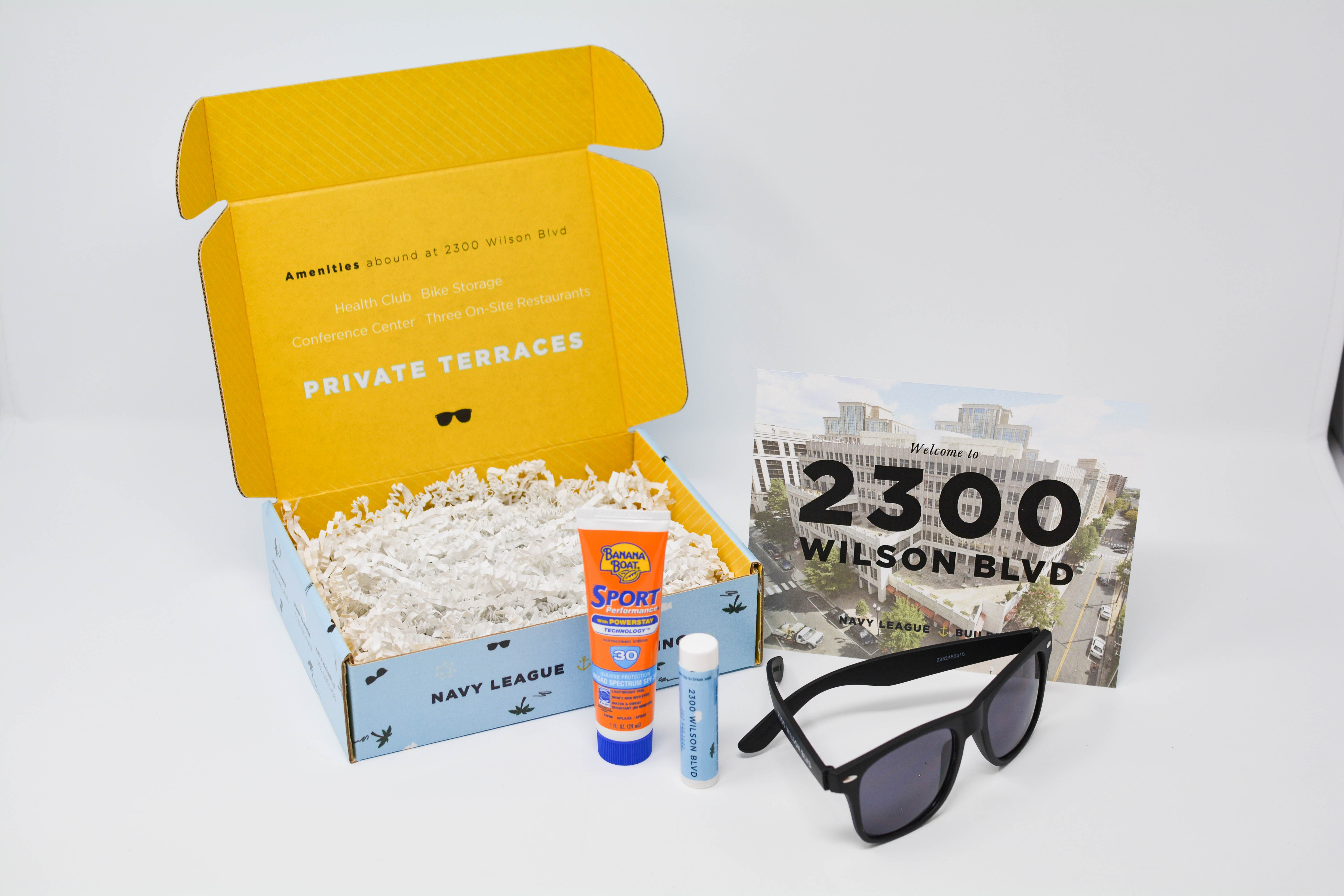
THE NAVY LEAGUE BUILDING
www.2300wilson.comPackaging design was excitedly anticipated and a new challenge to dive into. Summer was right around the corner and a perfect time to highlight the sunny outdoor terrace of the vacancy. The boxes were fully custom designed including the size, shape, pattern and displayed information. Branded sunglasses and lip balm were paired with sunscreen to deliver a cohesive message marketing the outdoor space and also be carried along after the initial gifting.
- hello@laurensteimle.com
- washington, dc
© Lauren Steimle Designs